As a Canadian Graphic Designer, I am always looking for new inspiration and ideas. Recently, my family journeyed to Barcelona, Spain. We were able to see some great places along the Mediterranean Coast and this trip provided a ton of new graphic design inspiration!
Might I add, I saw a plenty of graphic design inspiration that I LOVED! BUT—I’ve narrowed it down to showcase the top graphic design pieces that caught my attention while traveling to Spain:

Salon Nautico Brarcelona 2018 Boat Show
This was by far my favourite graphic design sighting of the trip! How clever! For the Salón Náutico Barcelona 2018 Boat Show, the graphic designer(s) added an element of realism by incorporating ocean waters to the letters “MAR” (on the left) and bottom left and top right corners on the right. This is such a great touch that instantly reaffirms the purpose of this marketing material to the reader.

En Compañía de Lobos
This menu for En Compañía de Lobos stood out from other restaurants (and not only because of its size)! I absolutely LOVE the balance achieved from this menu design with a variety of bright coloured illustrations and letters placed strategically around and behind the menu text. Great balance can make or break a piece, and this designer(s) get two thumbs up!
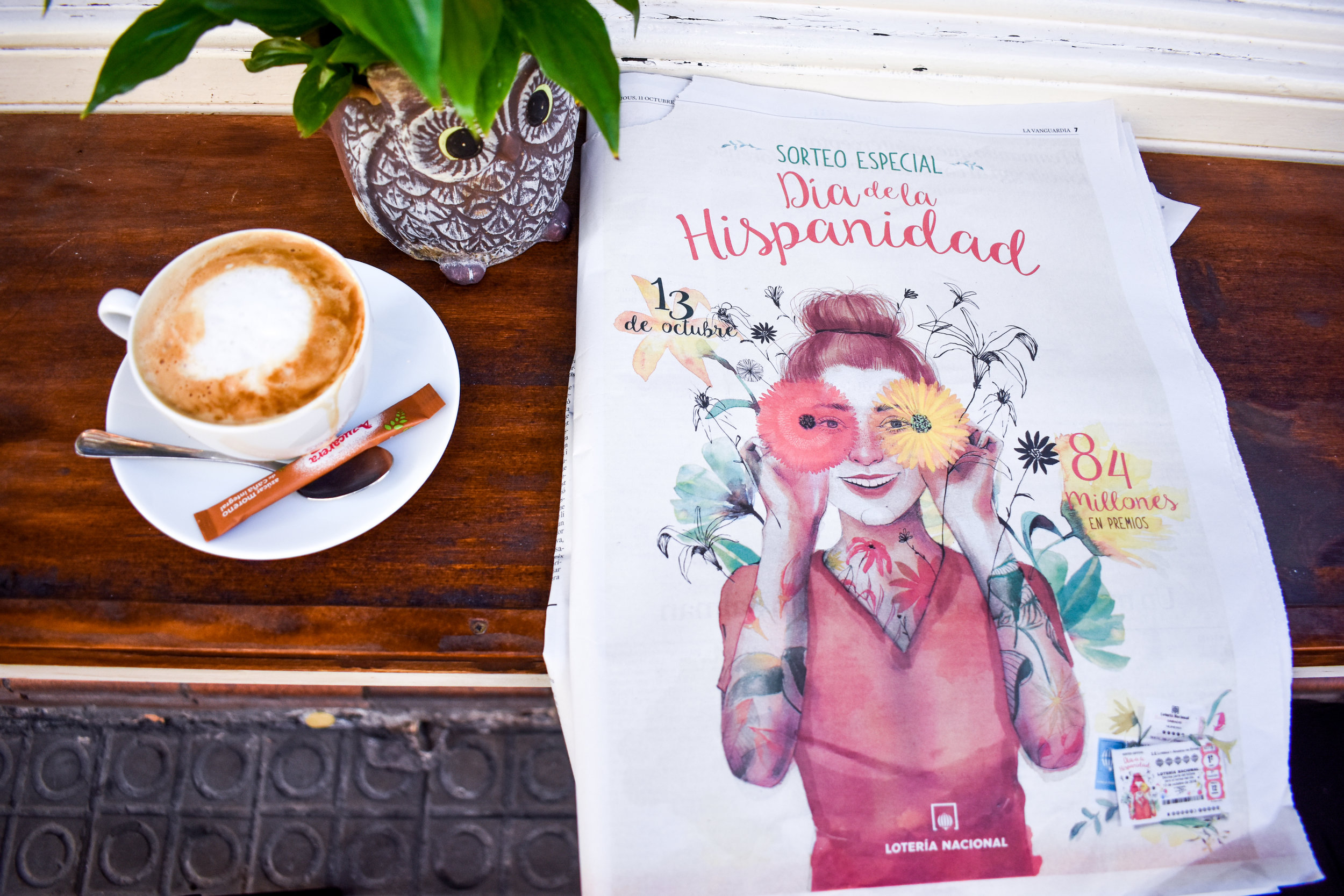
Lotería Nacional
Here’s an advertisement for a lottery from the Lotería Nacional. My favourite part? The black pencil-like flowers that have the appearance that they were doodled on top of the girl. It’s a great idea that adds excitement to a marketing piece and can be used in several ways.
Side credit: This picture was taken outside my family’s go-to breakfast spot in Sarriá-Sant Gervasi called Laia (not entirely sure if that is how you spell it as this was a small ma and pa cafe that isn’t on Google). The owner was what kept us coming back. He was nice and friendly and although we had a hard time conversing (he knew little English and we knew little Spanish), we had some great laughs. He also always gave us a little takeaway every time we were there (which was a lot!). He must have read Gary Vaynerchuk’s Jab, Jab, Jab, Right Hook book! Because we kept going back!

L’Aquarium Barcelona
Throughout the L’Aquarium Barcelona, you can see the theme through their marketing efforts (including their logo), that this aquarium is a children’s dream destination by the abundance of juvenile colouring. I love it! The drawing-like creatures repeated across all marketing materials for the aquarium adds the feeling of fun and youth.

Pampling
This graphic design wall art at Pampling, a boutique t-shirt shop in Sitges, 35km south of Barcelona, Spain caught my attention instantly. Not to mention, the abundance of unique and humorous t-shirts stocked throughout. I love the use of blue-coloured illustrations on the walls that are accompanied by a few portraits of people. A great contrast, and again, ties in with the business’s marketing perfectly!

FC Barcelona
Sports teams always seem to do a great job at graphic design, and FC Barcelona, the well-known and respected football club proves just that. The use of transparency purposely draws your eyes to read the darker shades (text in the centre) first, before the lighter text in the back. I’ve seen this before, but it was nice to have it confirmed that this technique is timeless. I enjoy the diagonal lines that have been added to a few of the corners of the darker text.

Els Gats de Sitges
I stumbled upon this piece of art (poster) while walking in Sitges that promotes the Art Lukas Studio. This poster is attractive, interesting and stood out amongst other surrounding ads. Funny enough, Els Gats de Sitges is an art school that hosts workshops. My favourite part about this piece? It’s fantastic use of direction. It purposely draws your eyes to read the text at the top, then quickly skim to the illustrated cats at the bottom, and then jump back to the middle to read the small text.

Dr Game
As I know little Spanish, the words appearing in Dr Game’s logo didn’t mean much to me. I did however, recognize the “G” as a scrabble piece. After digging around to see what this store was all about, I discovered that this is a place where you can go to play games. After translating the caption under the logo which is not in Spanish, but Catalan, another common language in the area reading “Games, Leisure, Events”, it affirmed that this logo is on point with its messaging. The addition of the scrabble-looking game piece to the logo was wise.

Lucas Fox
Last but not least, this logo for Lucas Fox, an International Real Estate Agency, caught my attention. I love the simplicity of the logo and the symmetry of the brand mark. The flat corners of the diamond shape encompassing the “LF” that are separated into two pieces work beautifully with the font chosen for “LF”. The text saying “Lucas Fox” is far enough below the symbol, that a reader thoroughly looks at the logo symbol before scrolling down to read the company name and what it is all about.
When I set-off for my trip to Spain, I expected to see many well-dressed people (which I did). What I did not expect, was to see so many great graphic design techniques used at a variety of businesses. Every piece of marketing material that I saw there was beautifully designed, completed the business’s messaging and was unique and inspiring. If you are a Canadian Graphic Designer who is looking for new inspiration (and a trip), I highly recommend traveling to Spain. You are guaranteed to leave the country with a plethora of graphic design ideas.